
Marquetry is an art form in which wooden pieces of different natural colors are arranged to create a cohesive and beautiful design.
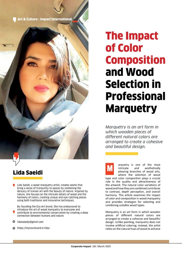
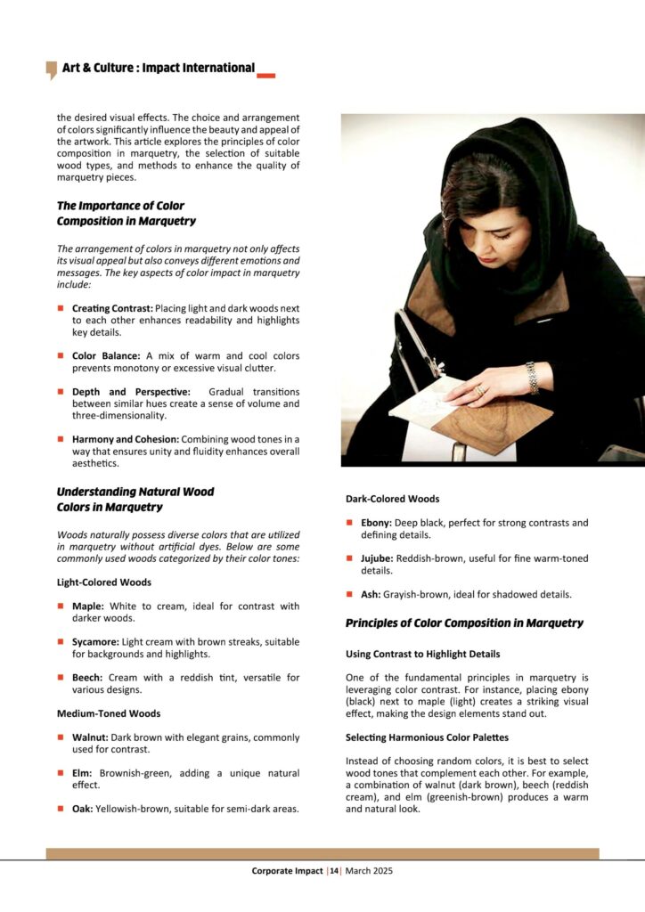
Lida Saeidi
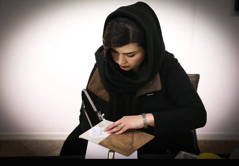
Lida Saeidi, a wood marquetry artist, creates works that bring a sense of tranquility to spaces by combining the delicacy of Iranian art with the beauty of nature. Inspired by nature, she focuses on the intricate details of wood and the harmony of colors, creating unique and eye-catching pieces using both traditional and innovative techniques.
By founding the Eco Art brand, She has endeavored to introduce the art of wood marquetry to everyone and contribute to environmental conservation by creating a deep connection between humans and nature.
Marquetry is one of the most intricate and aesthetically pleasing branches of wood arts, where the selection of wood type and color composition plays a crucial role in the quality and attractiveness of the artwork. The natural color variations of wood and how they are combined contribute to contrast, depth perception, and overall harmony. This article examines the impact of color and composition in wood marquetry and provides strategies for selecting and combining suitable wood types.
Marquetry is an art form in which wooden pieces of different natural colors are arranged to create a cohesive and beautiful design. Unlike painting, marquetry does not involve artificial coloring; instead, the artist relies on the natural hues of wood to achieve the desired visual effects. The choice and arrangement of colors significantly influence the beauty and appeal of the artwork. This article explores the principles of color composition in marquetry, the selection of suitable wood types, and methods to enhance the quality of marquetry pieces.

The Importance of Color
Composition in Marquetry
The arrangement of colors in marquetry not only affects its visual appeal but also conveys different emotions and messages. The key aspects of color impact in marquetry include:
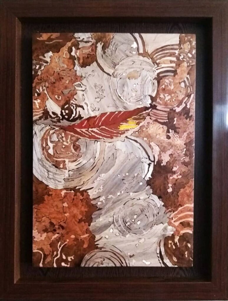
Creating Contrast: Placing light and dark woods next to each other enhances readability and highlights key details.
Color Balance: A mix of warm and cool colors prevents monotony or excessive visual clutter.
Depth and Perspective: Gradual transitions between similar hues create a sense of volume and three-dimensionality.
Harmony and Cohesion: Combining wood tones in a way that ensures unity and fluidity enhances overall aesthetics.
Understanding Natural Wood
Colors in Marquetry
Woods naturally possess diverse colors that are utilized in marquetry without artificial dyes. Below are some commonly used woods categorized by their color tones:
Light-Colored Woods
Maple: White to cream, ideal for contrast with darker woods.
Sycamore: Light cream with brown streaks, suitable for backgrounds and highlights.
Beech: Cream with a reddish tint, versatile for various designs.
Medium-Toned Woods
Walnut: Dark brown with elegant grains, commonly used for contrast.
Elm: Brownish-green, adding a unique natural effect.
Oak: Yellowish-brown, suitable for semi-dark areas.
Dark-Colored Woods
Ebony: Deep black, perfect for strong contrasts and defining details.
Jujube: Reddish-brown, useful for fine warm-toned details.
Ash: Grayish-brown, ideal for shadowed details.
Principles of Color Composition in Marquetry
Using Contrast to Highlight Details
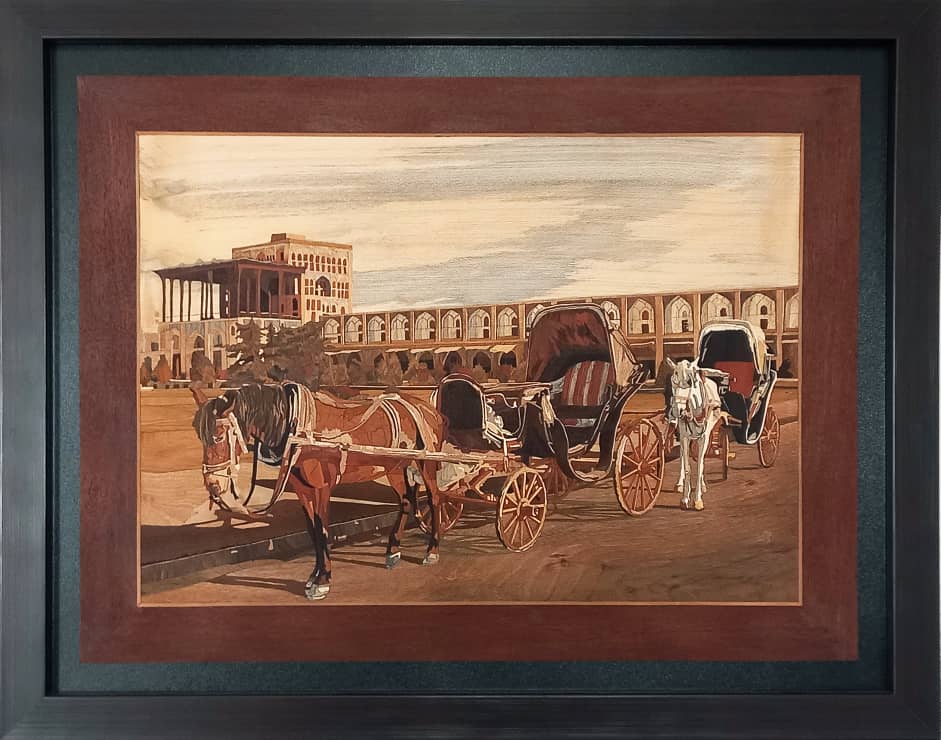
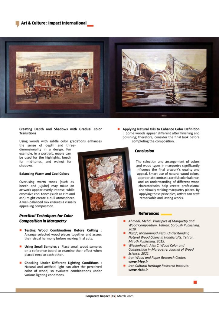
One of the fundamental principles in marquetry is leveraging color contrast. For instance, placing ebony (black) next to maple (light) creates a striking visual effect, making the design elements stand out.
Selecting Harmonious Color Palettes
Instead of choosing random colors, it is best to select wood tones that complement each other. For example, a combination of walnut (dark brown), beech (reddish cream), and elm (greenish-brown) produces a warm and natural look.
Creating Depth and Shadows with Gradual Color Transitions
Using woods with subtle color gradations enhances the sense of depth and three-dimensionality in a design. For example, in a portrait, maple can be used for the highlights, beech for mid-tones, and walnut for shadows.

Balancing Warm and Cool Colors
Overusing warm tones (such as beech and jujube) may make an artwork appear overly intense, while excessive cool tones (such as elm and ash) might create a dull atmosphere. A well-balanced mix ensures a visually appealing composition.
Practical Techniques for Color
Composition in Marquetry
Testing Wood Combinations Before Cutting : Arrange selected wood pieces together and assess their visual harmony before making final cuts.
Using Small Samples : Place small wood samples on a reference board to examine their effect when placed next to each other.
Checking Under Different Lighting Conditions : Natural and artificial light can alter the perceived color of wood, so evaluate combinations under various lighting conditions.
Applying Natural Oils to Enhance Color Definition : Some woods appear different after finishing and polishing; therefore, consider the final look before completing the composition.
Conclusion
The selection and arrangement of colors and wood types in marquetry significantly influence the final artwork’s quality and appeal. Smart use of natural wood colors, appropriate contrast, careful color balance, and an understanding of different wood characteristics help create professional and visually striking marquetry pieces. By applying these principles, artists can craft remarkable and lasting works.
References
Ahmadi, Mehdi. Principles of Marquetry and Wood Composition. Tehran: Soroush Publishing, 2018.
n Najafi, Mohammad Reza. Understanding Natural Wood Colors in Handicrafts. Tehran: Mirath Publishing, 2015.
Wiedenhoeft, Alex C. Wood Color and Composition in Marquetry. Journal of Wood Science, 2021.
Iran Wood and Paper Research Center:
www.iripp.ir
n Iran Cultural Heritage Research Institute:
www.richt.ir


